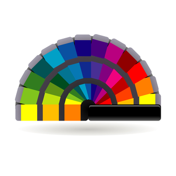
While your primary goal is to attract customers, you also have to consider what you’d like as a logo design and what would be best for your brand. Your logo designer can help you discover what colours have brought success for logos for brands that are similar to yours. Evaluate the colours that failed for brands that are similar to yours, this can offer valuable information as well. The current trend of flat logo design offers room for lots of colors, so your logo designer should be able to combine colors that both please you and attract customers.
Red is an extreme color which has been proven to simulate a higher heart pulse rate and rapid breathing in viewers. Red is bold and associated with youth and excitement.
Orange is a colour associated with amusement, frivolity , and entertainment. Orange can also indicate cheerfulness, friendliness, and confidence.
Yellow also carries an association with fun, it’s also commonly associated with joy. For your company it can be an indicator of optimism, clarity, and warmth.
Green is a common color that reminds us of nature. It’s associated with peace, health, and growth. It’s also often associated with money.
Blue is another peaceful and calming color. If denotes trust, strength, and dependability.
Purple is the color of royalty and majesty. It can evoke thoughts of creativity, majesty, and wisdom.
Black is the color of mystery and the priesthood. It can also represent authority and power.
White is commonly associated with innocence and purity. Its a neutral color that can create a sense of balance and calmness.
 Logos are a visual summary of all the values, products and services that your brand stands for. Your logo design and colours have to catch the eye of consumers who are bombarded with thousands of logos every day. Bold and creative use of colour can inspire emotion within consumers. Consumers are often motivated by emotion, so you need to choose the colours that will encourage them to buy your brand.
As you can see, there’s a lot to consider when choosing colour for your logo. With just a little research, you can learn a lot about colour theory. Ultimately you have to choose what works best for you, your customers, and your brand. Our expert logo designers here at Thought Media will be glad to answer any of your logo colour questions as well as assist you with all your logo design needs.


0 Comments